Polk Apothecary
Every brand tells a story.
Redesigning an e-commerce experience that builds trust through education while highlighting brand values of being natural and clean.

Project Snapshot
Date
Dec 2025
Role
UX Designer
Timeline
3 Weeks
Team
Solo
Tools
Figma, FigJam, FigSlides, Google Workspace
The Story Begins
Brand is an experience.
Before this project, my skincare knowledge was limited to my own journey of “does this work with sensitive skin” and “is it affordable”. I quickly learned that customers weren’t simply buying what was affordable or what just seemed to work; they were investing in confidence and products that would become a part of their daily routine.
Getting Curious
Our Challenge
Morgan wanted to provide the same level of care and education online, that she provides to her in-person esthetician clients. But the current website was creating friction and barriers in developing that purchase confidence.
What I Wanted To Learn
Going into the research phase, I wanted to understand what is the driving force that helps skincare customers go from hesitant to purchase made. I was excited to understand how improvements to a current design could directly impact business goals and user experience with my first Heuristic Evaluation using the LEMERS format.
User Conversations
"Once I find a product I trust, then I'm loyal."
Throughout my conversations with various skincare users, a few themes emerged. Users enjoy the ease of shopping online, but appreciate the education provided in person that leads to their purchase decision. They want to feel informed on how to easily incorporate a product into their lives such as how to use it, what it's made of, and how it's performed with other skincare users. They tend to learn towards becoming loyal to a brand that align with their values, such as if a brands sells products with natural and clean ingredients.
Competitive Analysis
My market research solidified what users were saying through my interviews, and gave me an idea of how these ideas were implemented well.
Direct competitors Hyper Skin showed how to utilize iconography to express product value and detail.
Direct Competitor 54 Thrones showed the impact of using real customer experiences to build trust and value.
Direct Competitor Herb N' Eden gave wonderful examples on how to share information and values, without impacting the ability to shop seamlessly.
Indirect competitors Drink Olipop shares how to clearly communicate brand values and product features without overwhelming the customer.
Indirect Competitor Sienna Naturals allows customer to find the products that will fit their needs with clear navigation, quizzes, and CTA's.


What Changed My Thinking
I thought skincare shoppers needed to be able to find products easily, based on skin type or price. Instead, I learned that they needed to feel informed about the product before they feel confident in making any purchase decisions.
Designing Trust
Reviews: This design decision was made after users expressed that they look to the insights of how a product works with similar skin types before trying it themselves. Competitive analysis solidified the impact of community discussions such as reviews and customer shared photos.
Ingredients: The decision to incorporate this aspect across the site was made after research uncovered that users preferred to be educated on product ingredients and sourcing when building trust in a product. Usability test confirmed the impact of this feature during each iteration.
Iconography: This design decision came together when users expressed wanting to purchase from brands who's values aligned with theirs. Market research and usability test showed users favored the use of iconography for quick reviews of product details before purchases.
Implementing into daily life: The decision to incorporate a "step by step" guide and suggested products to complete the routine was made after research uncovered users needed direction on product usage. Usability tests expressed the helpfulness of this design decision.


Bringing it to Life
My new framework for the Polk Apothecary redesign was an e-commerce site that focuses on addressing each persons unique skincare concerns with natural products. It informs users on the ingredients in their products as well as their function, educates consumers on how to use and incorporate products into their routine, and highlights the brands values such as their use of natural and clean ingredients.
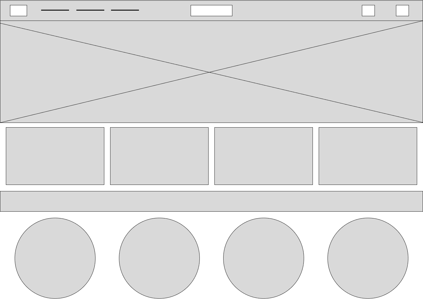

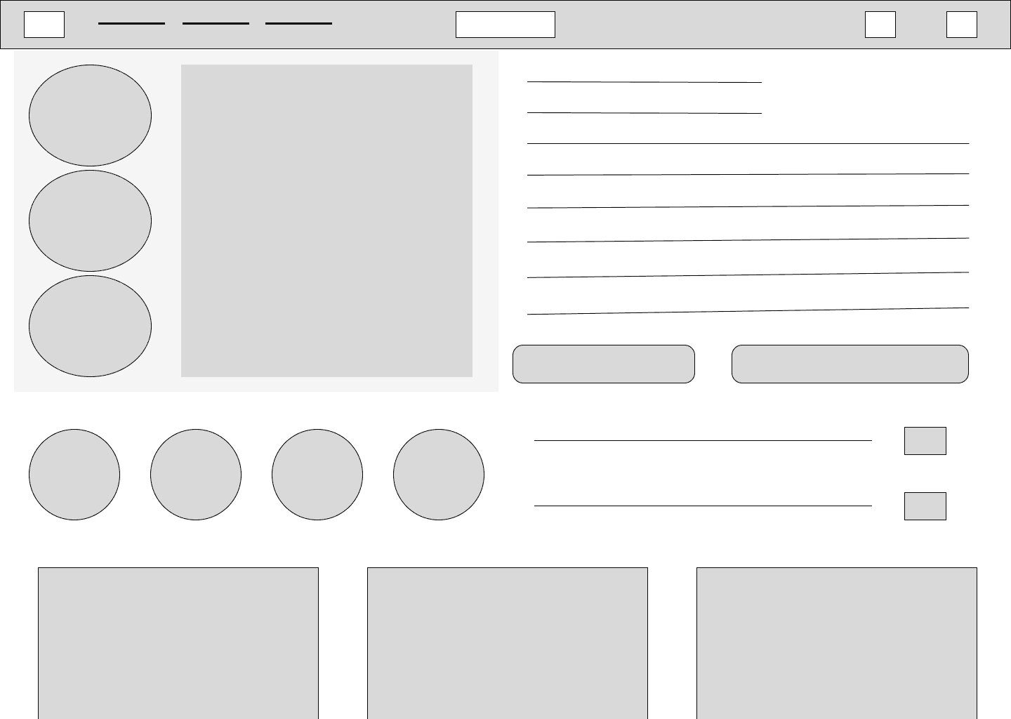

After conducting multiple rounds of usability testing, our final product addressed button clarity issues, order confirmation, and created a much more seamless shopping experience.
Looking Back


What I'm Proud Of
This was my first ever full UX Design project that I completed from end-to-end on my own. I developed everything from the interview guide, the market analysis, all the way to the wireframes, and prototypes. It felt great to put into action what I was learning in bootcamp.
What Challenged Me
I wanted to push myself to try creating features we weren’t taught in class. I spent time playing around in Figma learning drop down features and transitions that brought the site more charm.
What I Learned
This project was a great lesson in putting aside assumptions. As a skincare user myself, I knew the reasons why I purchased skincare would not hold true for everyone. I enjoyed engaging in conversations with users doing the research phase and uncovering user challenges, such as the frustration behind purchasing a product and not knowing how to properly incorporate it into their daily routine, and using that information with my design decisions.
What I'd Explore Next
Education was a huge piece of what users said they needed to feel confident in their purchase. I would explore more of how the different aspects of education were incorporated throughout the site, expand into video tutorials, and ensure that every user felt they received the information they needed to proceed with their purchase.
Follow along on persona 'Coco's' journey.

